HOME
The Apothecary Network
PROJECT OVERVIEW
THE PROBLEM
The Apothecary Network is a herbalism “Grow Your Own Apothecary” knowledge-share to allow people to begin their own journeys in herbalism and reclaim green spaces for themselves and their communities.
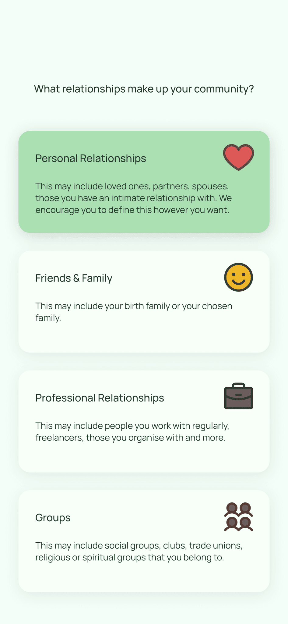
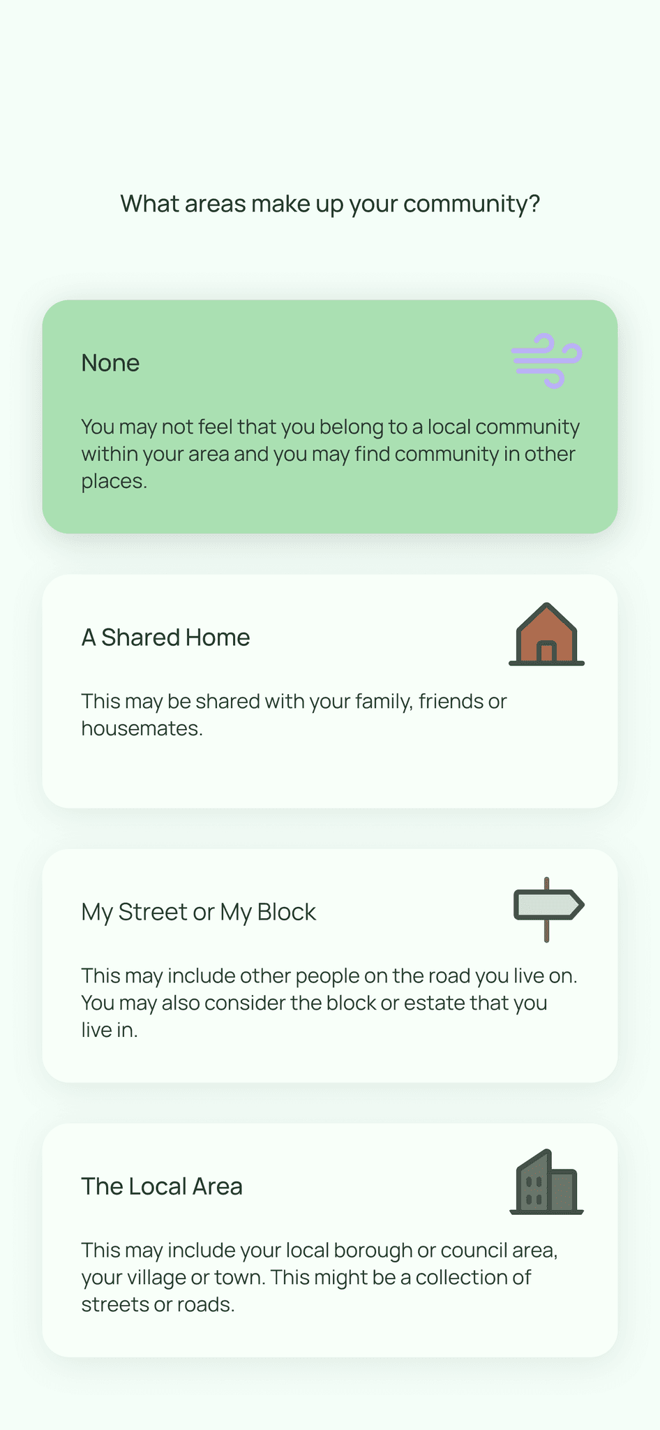
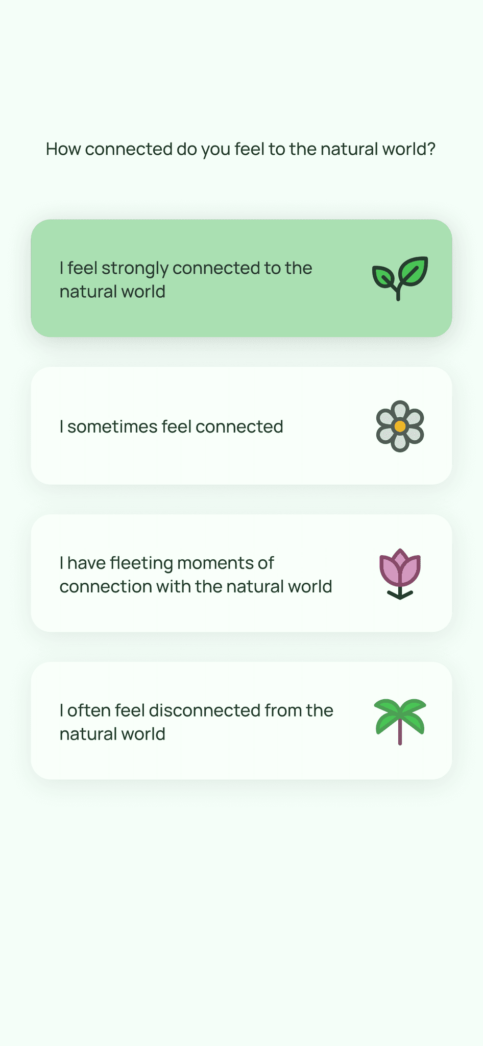
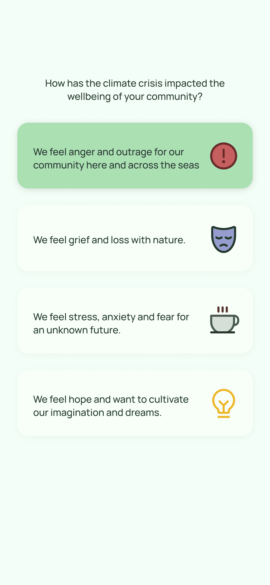
Creating an easy to understand onboarding flow as well as profiles for users to see which plants they could potentially grow as well as viewing herbal remedies using these plants.
THE OUTCOME
PROJECT HIGHLIGHTS
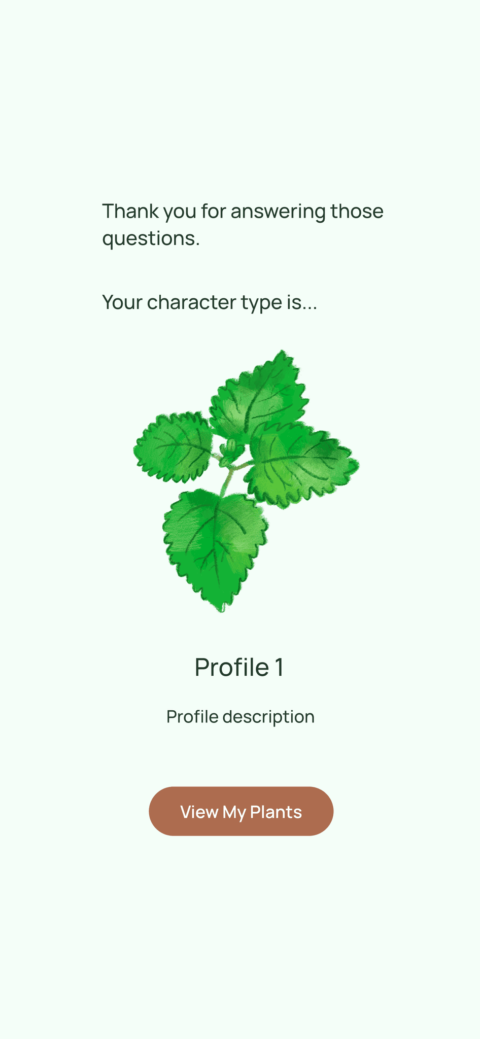
When I initially began this project I was required to flesh out an idea for an onboarding flow which would present a profile to a user based on their answers to a number of questions.
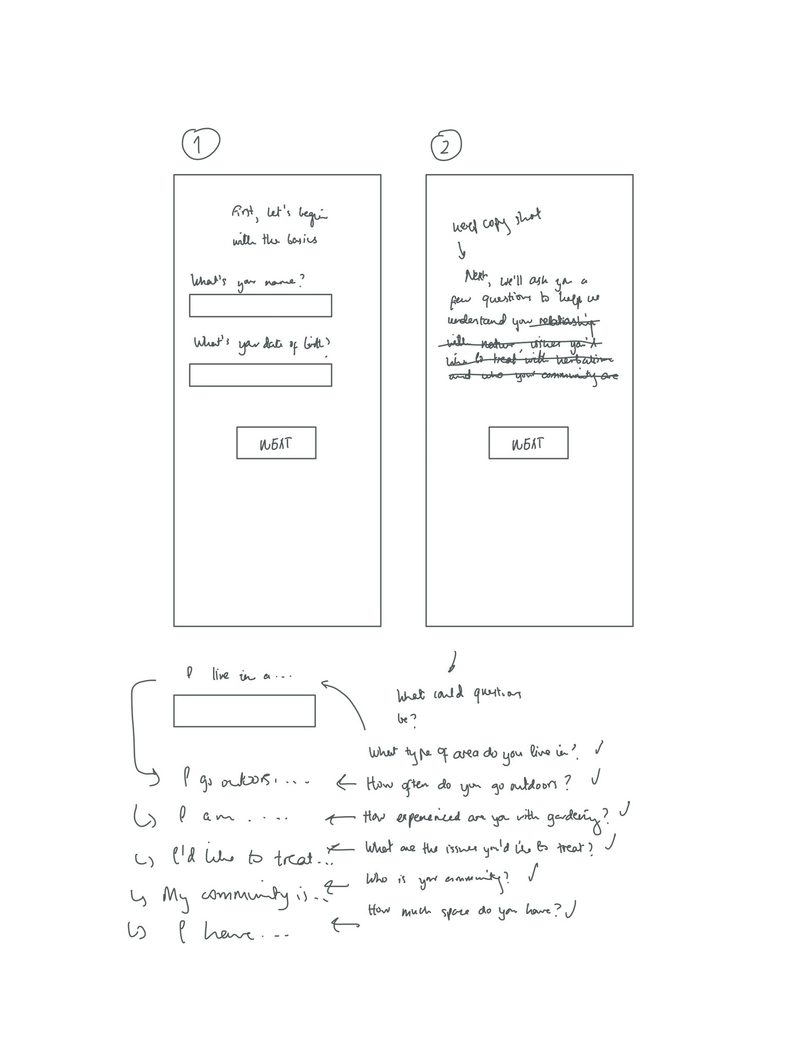
I began by sketching out some screens as well as brainstorming question ideas.
After completing these sketches I created an initial logo, combining an internet icon and plant motifs to symbolise the collaboration between technology and herbalism within this project.
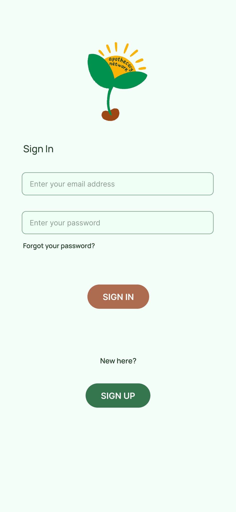
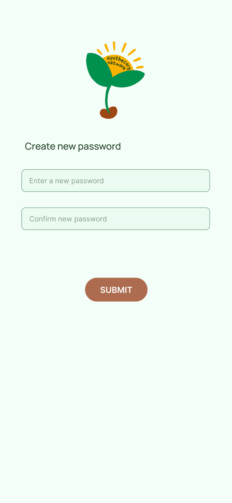
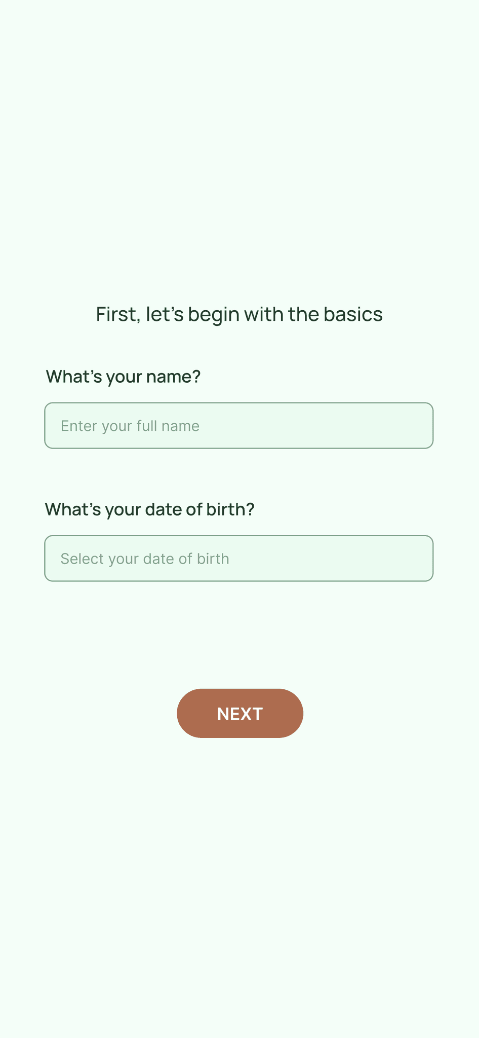
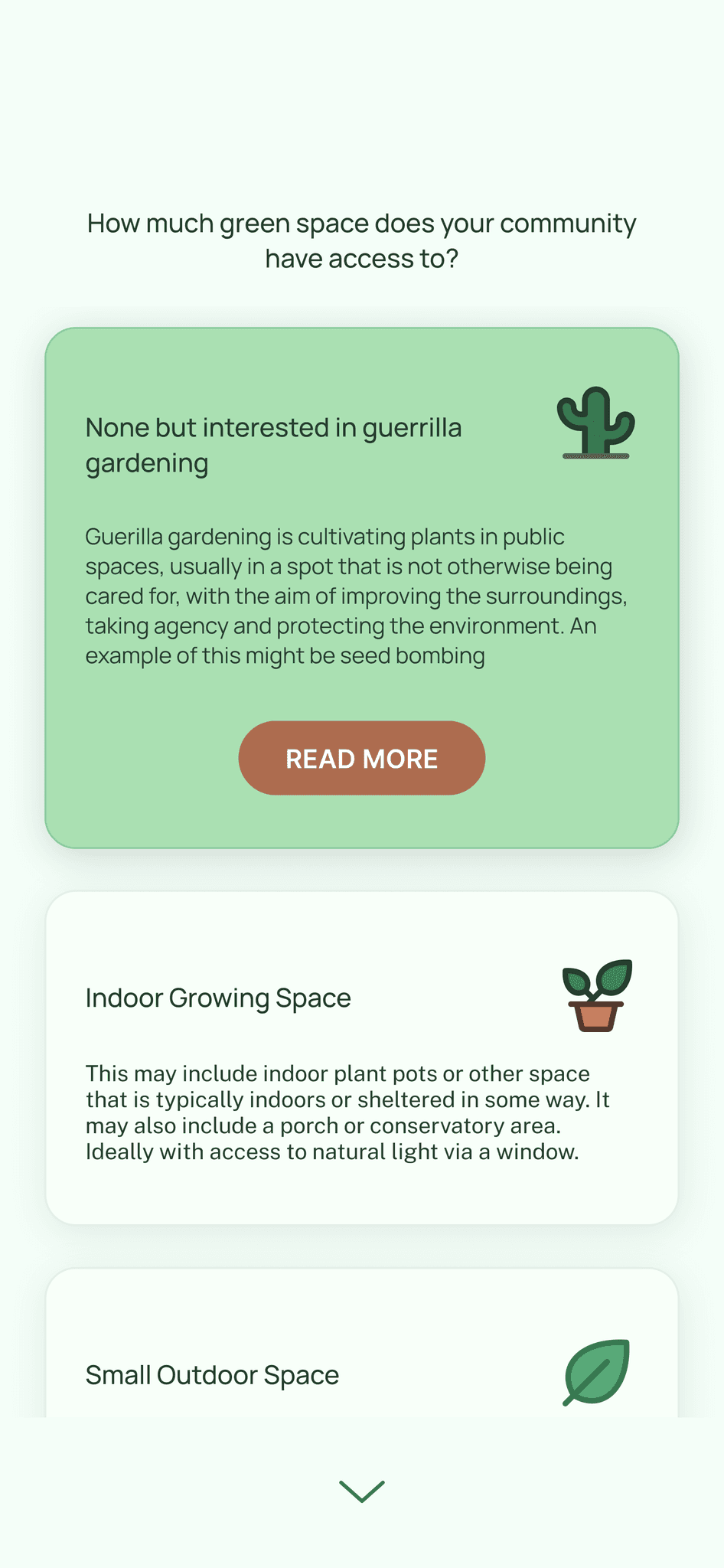
After completing the logo I created a simple UI and then prototyped the onboarding flow.
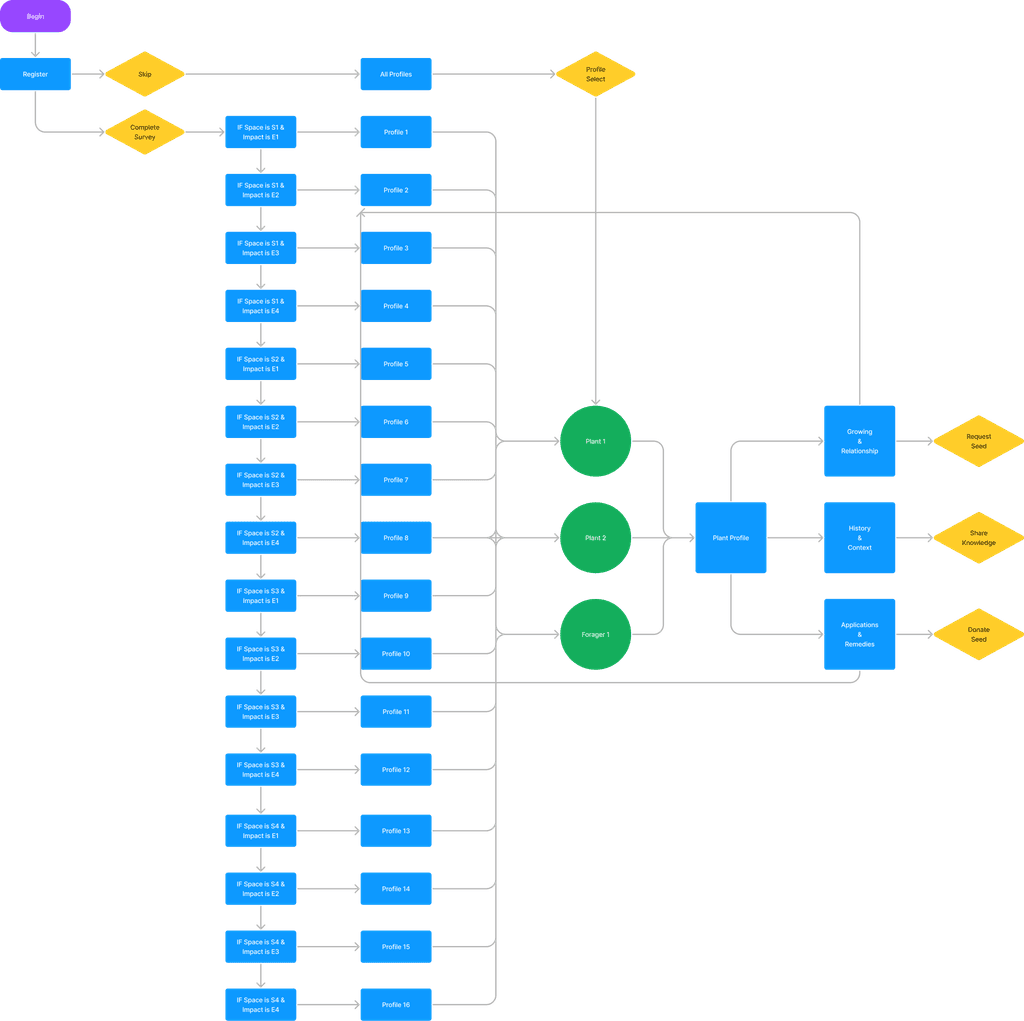
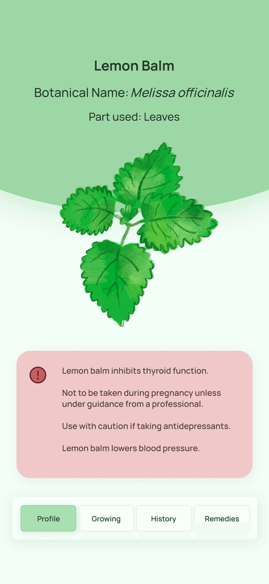
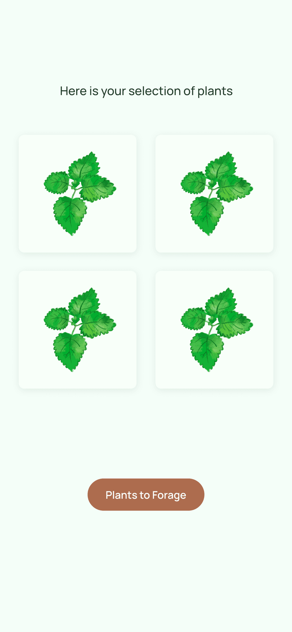
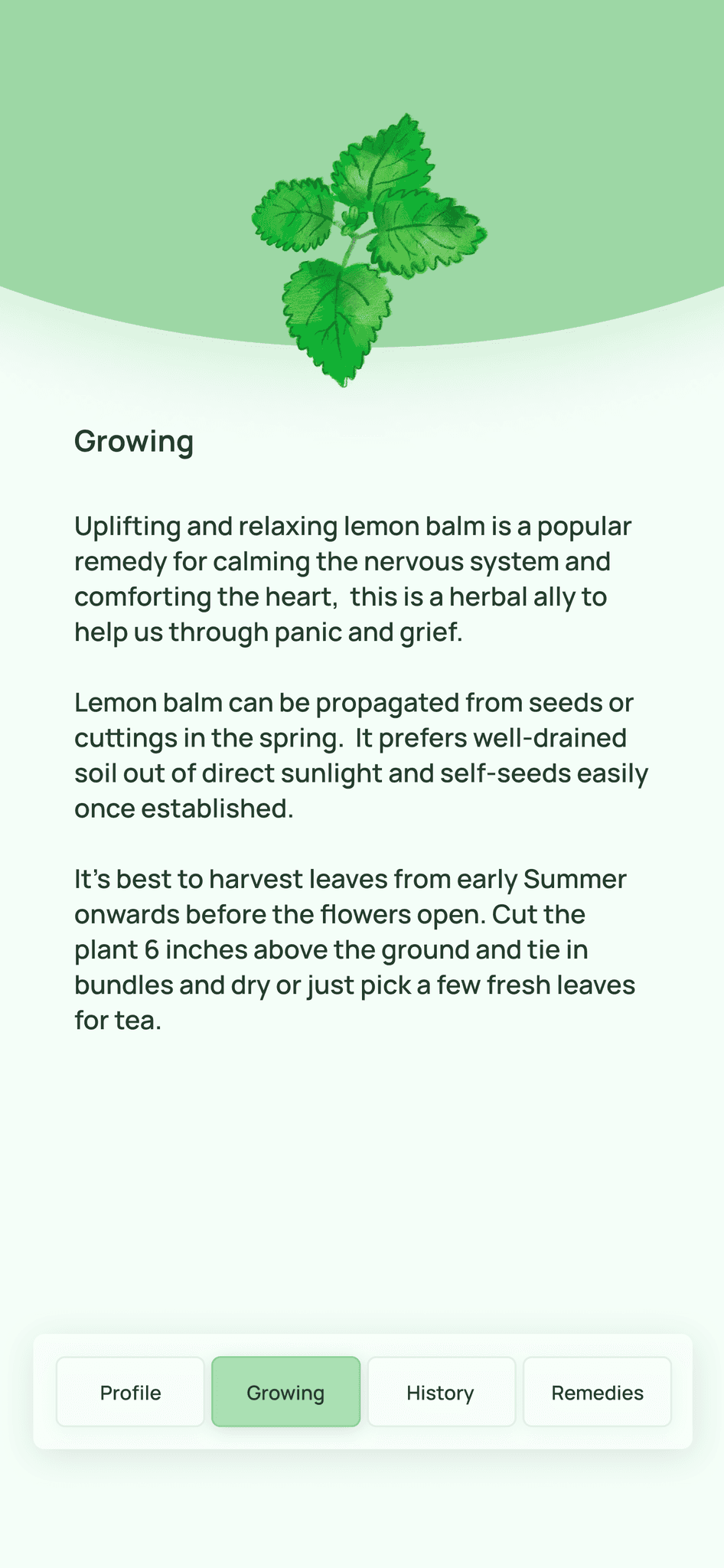
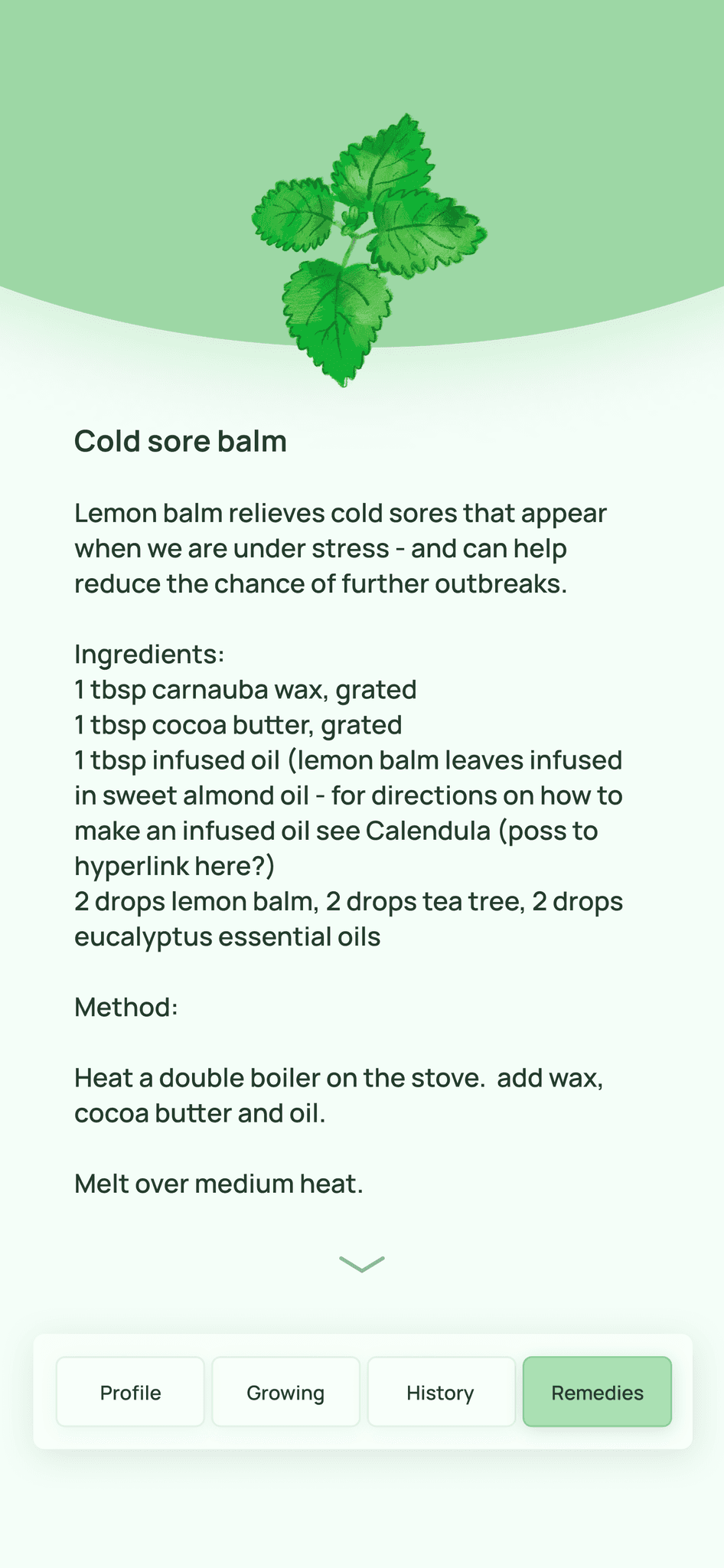
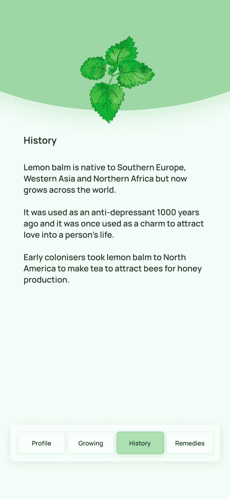
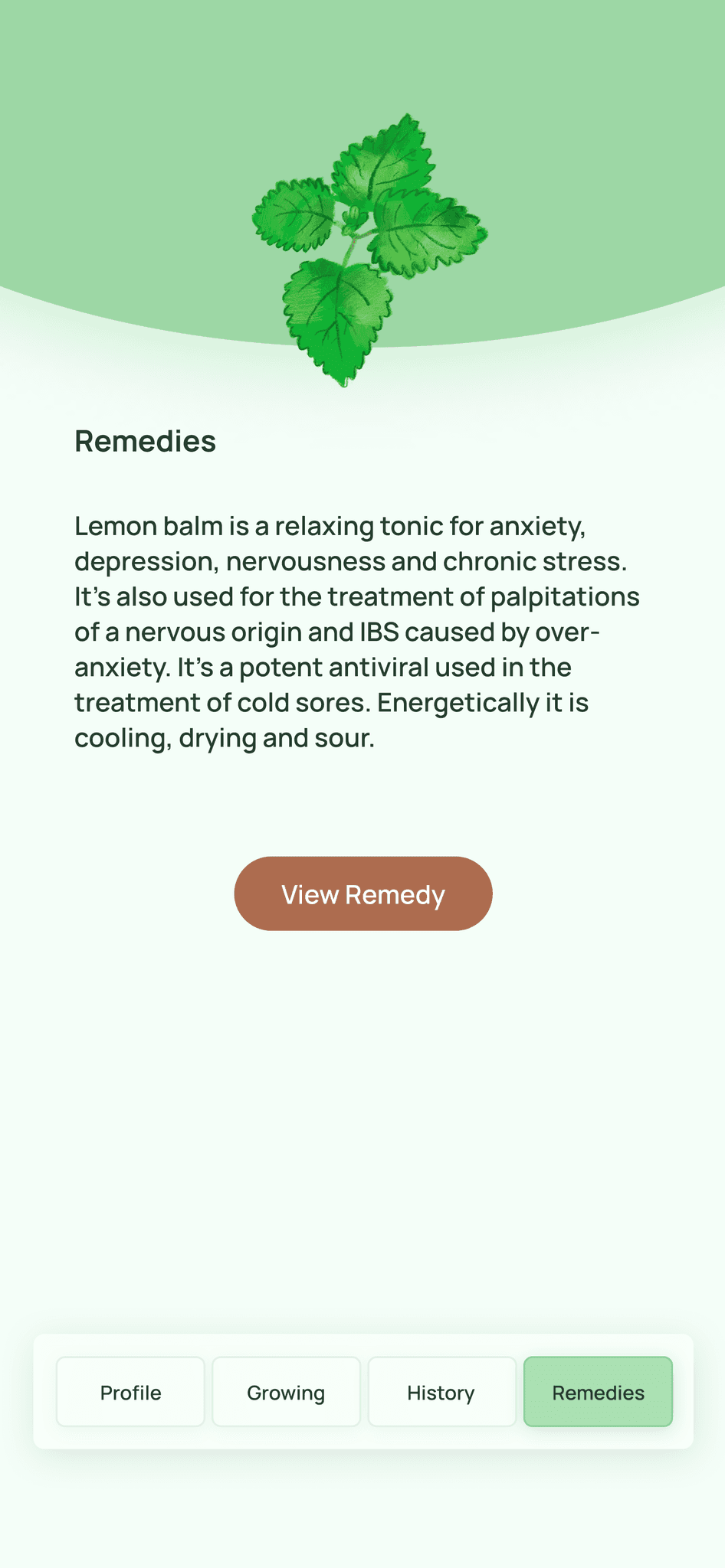
After presenting the onboarding flow to my team I was tasked with adding conditional logic to this prototype which allowed users to be matched with up to 16 individual profiles depending on their answers to the questions within this flow. I also added plant profile pages to provide information about the plants users were matched with.
The producer created a flowchart to assist me with the information architecture for this task.
After receiving the flowchart I updated the UI to include 16 more profiles, changed the written content and added conditional logic to the prototype.
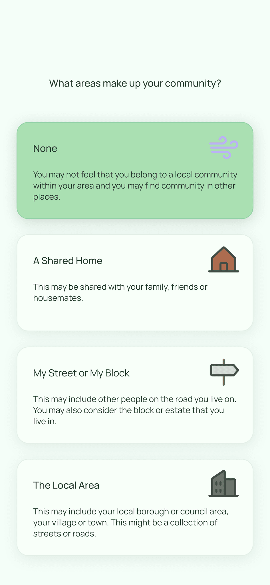
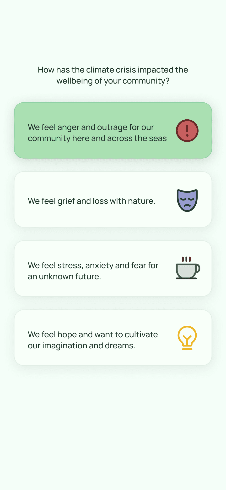
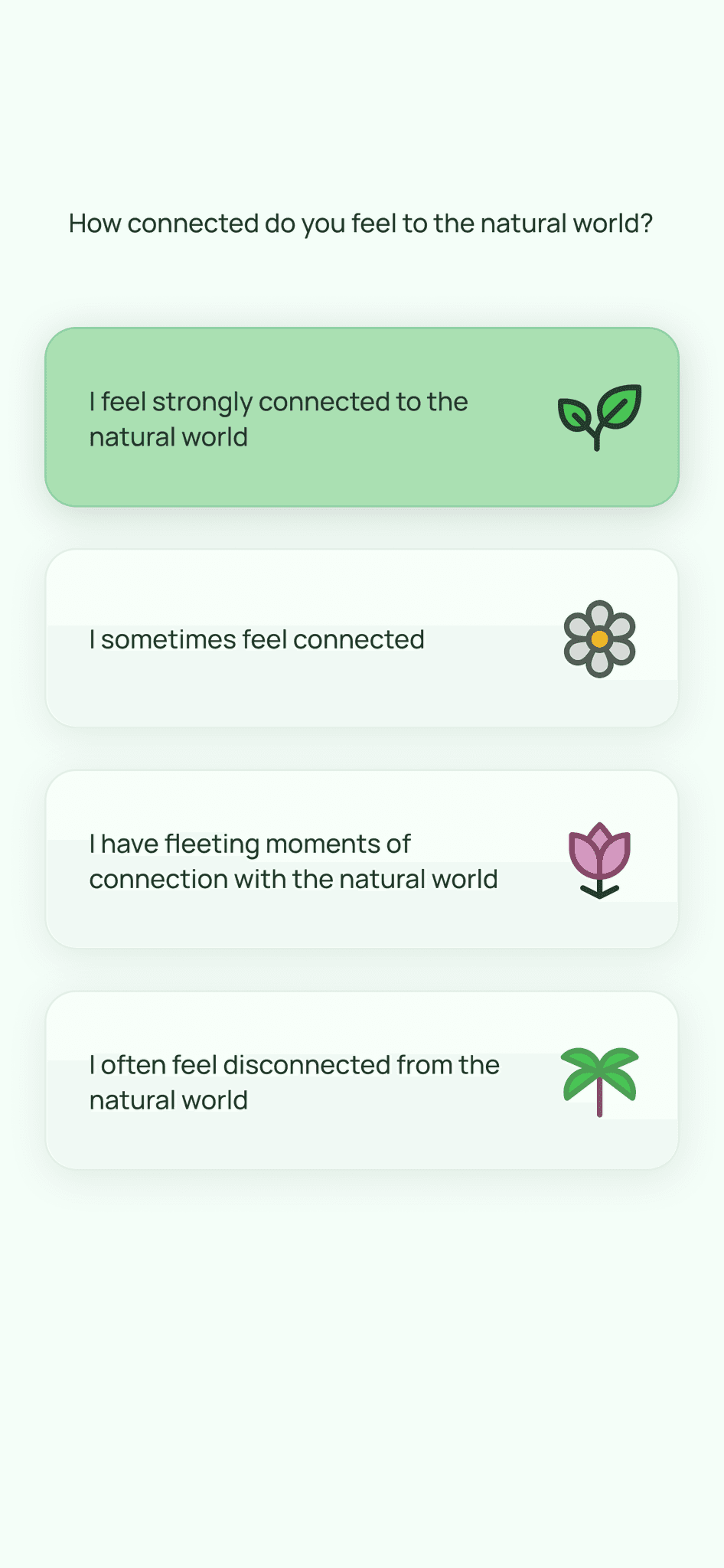
Once the logic was signed off, I was tasked with reskinning the UI. I incorporated neumorphism in order to give the design a cleaner, more minimal aesthetic.
Alongside this I also created more screens for the plant profile section of the prototype.
After creating this UI I wanted to tweak it slightly in order to make the design clearer, I did this by adding a stroke to the card elements within the UI.
I created the final prototype below and tested this in person with users.
Users reported ease of use, a simple onboarding process and effective accessibility.
THE PROCESS
DESIGN

ABOUT
